It's The First Philly Dingbats, Obviously.

Philadelphia, PA (PRWEB) August 22, 2017 -- The premier collection of original Philadelphia-inspired icons has joined the ranks of the neighborhood Philly Fonts. "The Obvious Philly Dingbats" are a fun series of stylized illustrations featuring various aspects of the City of Brotherly Love. The famous cheesesteak and soft pretzel are represented, along with an Italian horn, a familiar Philly bodega, and many more. There's a stack of coins and a dollar sign to symbolize the Philadelphia mint, and the diamond is representative of Jewelers' Row in Center City. The lighting bolt and kite are an ode to Ben Franklin's discovery of electricity. More historical nods include the Liberty Bell and the scroll.
"The Obvious Philly Dingbats" collection is available NOW, free for download at http://www.phillyfonts.com. "This project was just to get warmed up for our future Philly Icon releases. We have some edgier and more esoteric collections planned. This was a good way to get people to think about what icons they would like to us to create," Cliff says.
The next series is set to be released this coming fall, and they want your input. What elements of the city mean the most to you? Tell the Cliff Ross team what you want to see in the next set of Philly Dingbats by clicking here to access the survey. The most interesting and fun submissions will be included in the upcoming collection of 26 Dingbats.
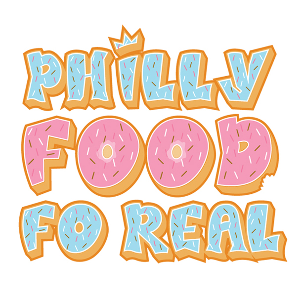
Many of the Philly Fonts are already being put to use. 'Easton Chips', a line of gourmet potato chips developed by Easton Salsa Company and Cliff Ross, utilize the 'Schuylkill Express' and 'Swampoodle' typefaces. Havana in New Hope, PA, frequently uses various Philly Fonts in their concert poster designs. More local businesses are also taking notice, such as Philly mainstay Forman's Pawnshop. Cliff Ross is working on a custom-designed typeface to be completed this fall. Danya, owner of the Philly-based food photo Instagram blog 'Philly Food Fo Real' is using a Philly Font for her business. "I was looking to create a logo that really embodied our Philly food blog and Instagram account, @PhillyFoodFoReal and had been searching online for 'philly fonts'," Danya explains. "We only showcase Philadelphia-area restaurants, so it was only fitting to find and use Cliff Ross's Philadelphia-themed fonts for our logo as well. We infused the West Philly font with food patterns and boom, our PhillyFoodFoReal logo was born!"
Follow @phillyfoodforeal on Instagram for mouthwatering photos of food taken all over the city of Philadelphia. As you can see, the design possibilities are endless as to what you can do with Philly Dingbats and Philly Fonts. Stay tuned for more new projects coming this autumn and be sure to follow Cliff Ross on Instagram @cliffrossinc.
Cliff Ross has deep roots in Philadelphia and a passion for its art and music scenes. He was the Art Director of Electric Factory Concerts from 1997 through 2004, where he worked with major acts such as Metallica, Dave Matthews Band and Pearl Jam. He's done various design work for a number of Philadelphia-based bands, such as The Burning Brides, Swift Technique, G Love & Special Sauce, and Splintered Sunlight. Cliff created the logo for The TLA on South Street and the logo for Ardmore Music Hall when they rebranded in 2014. The logo for the beloved Royal Tavern on Passyunk was designed by Cliff, as well. He now owns and operates two agencies based in Philadelphia and Easton, PA. Cliff Ross is a full service ad agency, design studio and print shop. He and his team work with clients in The Lehigh Valley, Philadelphia and The Poconos, specializing in custom font and dingbat design, graphic design, branding, advertising, web development, search engine optimization, social media and copy writing.
Cliff Ross, Cliff Ross Ad Agency, http://www.cliffross.com, +1 (610) 829-1333, [email protected]
Share this article